



CTA button · Interface design
Call-to-action buttons: giving the main click its own gravity
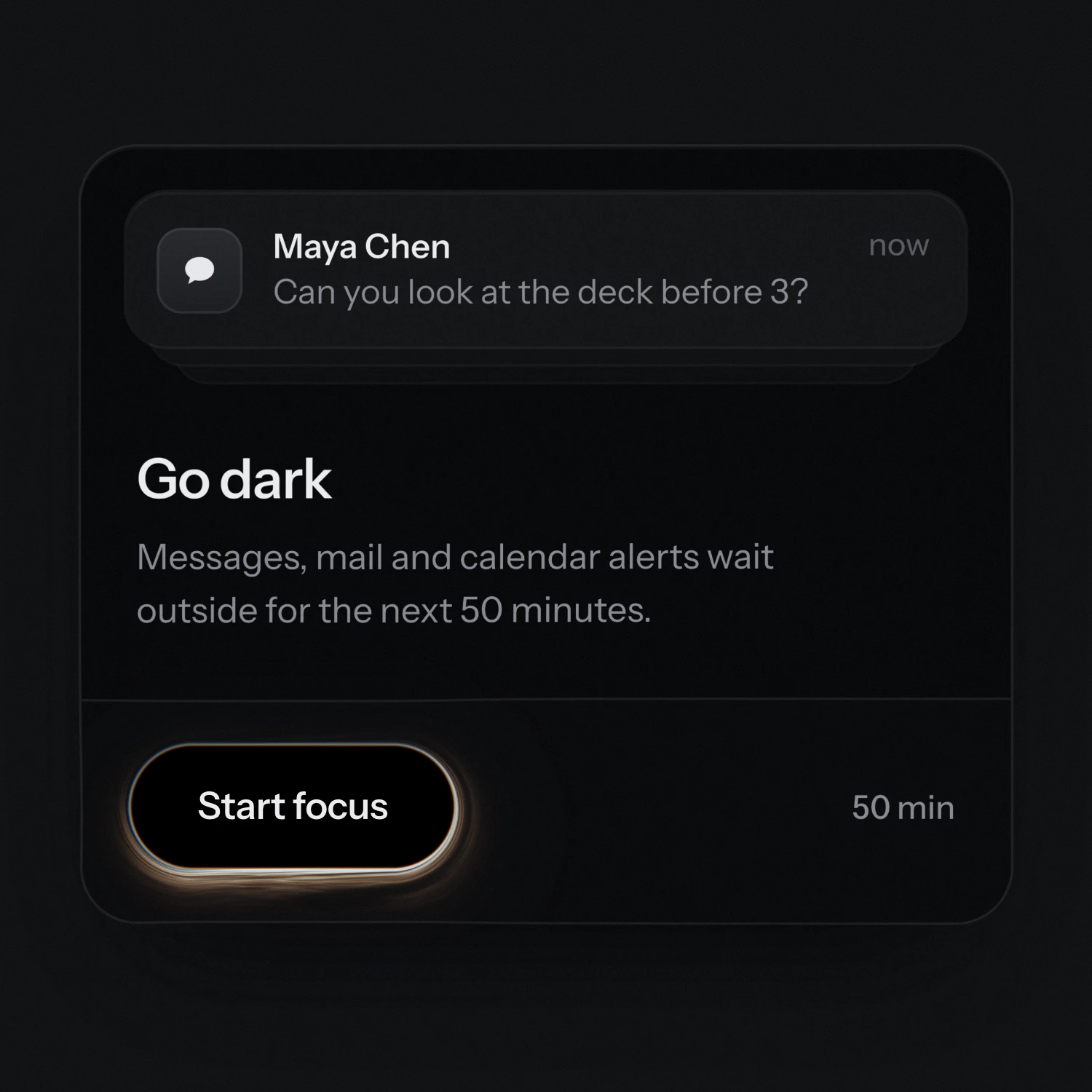
Demonstration of Event Horizon, a call-to-action button that bends the page.
Event Horizon — the click that bends the page
Media sourceThe call to action is the button a whole page is built around. It asks for the one click that matters. Yet most of them look alike: a bright pill, a short verb, an arrow at the end.
Inspired by Beautiful UI, a library of interface components by the studio Turbo, we wanted to give that click real weight. So the button is the black hole itself: a pure black pill whose edge is an event horizon. Warm light streams around it in fine strands, slowly, even at rest.
Hover it and the horizon wakes up. The whole button pulls on the card: the line above it sags, the text bends toward it, the edges lean in. Click, and the notification falls in and stretches on the way down, a timer takes its place, and ending focus gives it back.
The bending is drawn by hand in a shader and kept subtle, so the page always stays readable. But the idea reaches past one button: a black that absorbs, a warm light at the edges, motion that pulls instead of pops. That is enough to set the tone for a whole brand.