



InterCellar · Brand design
3D logos: giving volume meaning with InterCellar
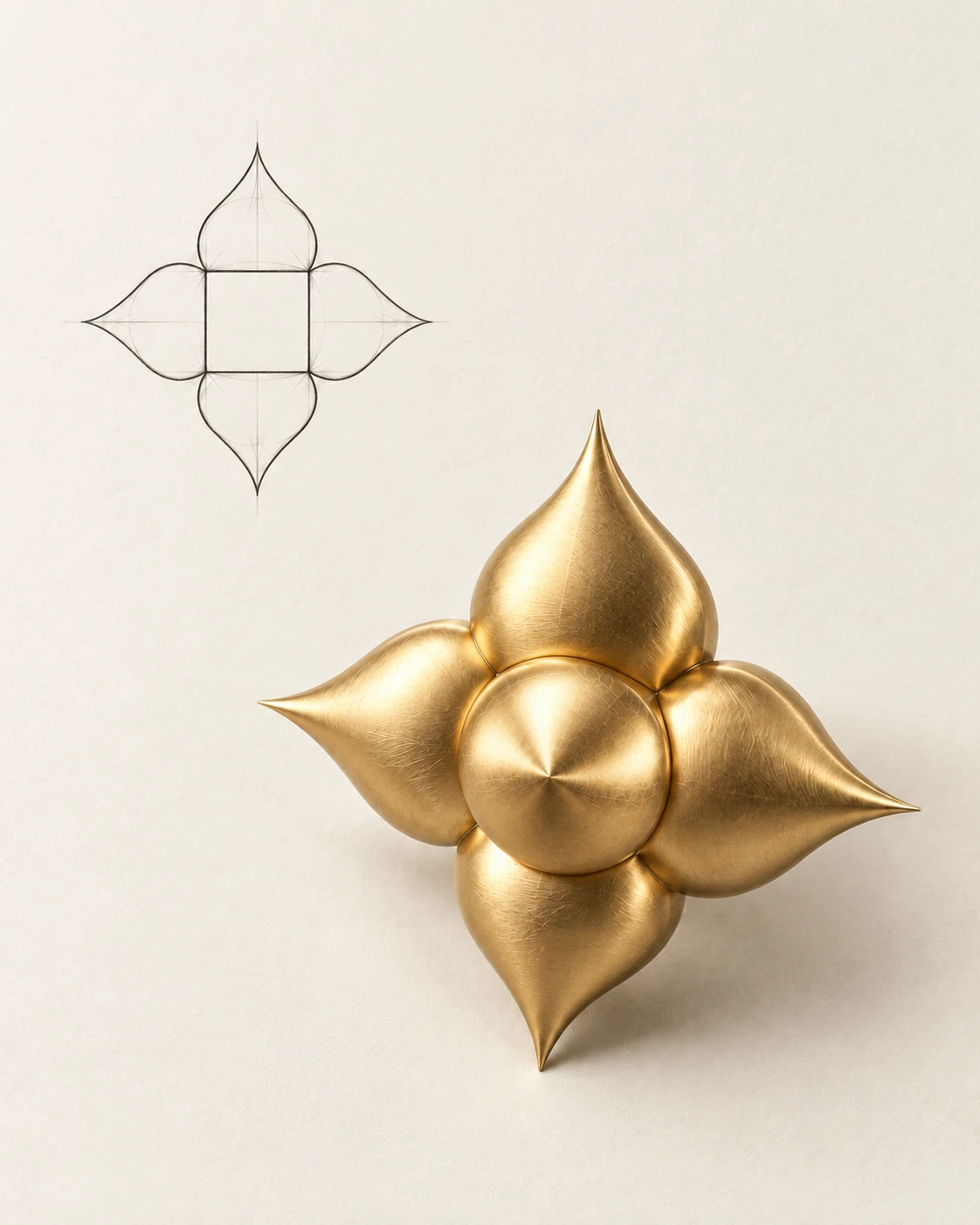
The InterCellar symbol: a geometric drawing of a four-pointed star and a sculptural golden interpretation in three dimensions.
InterCellar — from symbol to volume
Media sourceIn the InterCellar logo, a star also evokes four wine glasses raised in a toast. To take this 2D logo into 3D, we developed that double meaning through volume. The aim was to give the symbol a physical presence and new possibilities for visual expression.
InterCellar lets people buy wines stored in a cellar and own a digital twin of each bottle. Its name plays on the word ‘cellar’ and the sound of ‘Interstellar’. Wine and the star meet in the name itself; the logo translates that connection into a form.
In two dimensions, the symbol has four points. Their arrangement suggests glasses coming together for a toast. This detail connects the visual identity to a familiar gesture: sharing wine.
Moving into 3D transforms this four-pointed star into a six-pointed star. The symbol gains depth and can now be seen from different angles.
We shaped smooth, rounded volumes that stretch towards their tips. These forms evoke drops of wine coming together. The 3D modelling extends the language of the logo: the star, the glasses and the liquid remain connected.
With its golden material and reflections, the symbol takes on the presence of an object. It becomes an element around which to build images: a close-up of a curve, light revealing its volume, or a composition playing with its balance.
This freedom lets the identity live beyond its graphic signature. The star can be animated or staged, and the symbol can also be repeated to create a pattern. The goal is to expand its expressions while keeping it easy to recognise.
For us, giving a 3D logo meaning starts with identifying what its form already says. At InterCellar, volume develops a story already present in the drawing. Every curve keeps a connection to wine, and every variation to the same symbol.